
"A brilliant solution to the wrong problem can be worse than no solution at all: solve the correct problem." - Don Norman
Infinni
Creator management CRM Product Designer
JPMorgan Chase
Enterprise fintech platform formerchant payment services UX/UI Designer

Philips
Sleep & Respiratory Care UX/UI Designer Awarded Reddot Award 2022 Design Team of the Year
Johnson & Johnson
The Ethicon Team UX/UI Design Internship
Philips
Design Innovation Team UX/UI Design InternshipcOoffice
Home Employee Experience Hackathon - Winner


Let's talk 🤩

My name is He Zhu. I am a UX and Motion Designer.
In my field of experience, I mainly focus on human-centered design training and am passionate about research, problem-solving, and motion graphics.
I love traveling, cooking, drinking coffee, and outdoor activities.
✈️ 👨🏼🍳 🍻 ☕️ 🧗🏼♀️
Please don't hesitate to reach out to me. Let's have a nice coffee chat! 😊
Resume
Remote
Senior UX Designer
CRM - Lead Report & Analytics BU
Projects:
- CRM & API: Led 0-to-1 design for CRM and multi-platform API experiences.
- Dashboard & Analytics: Designed customizable dashboards, data visualization, and role-based reporting.
- Growth & AI: Designed campaign tracking tools and explored AI-powered analytics.
- Team Operations: Designed scheduling, workflow management, and permission systems.

Due to NDA, this project cannot be publicly displayed.
I’d be happy to walk through the process and outcomes in a live interview.
Email: hezhustudio@gmail.com
New York City
Senior UX Designer – Corporate & Investment Banking
Enterprise Software - Navigator
Projects:
Enterprise Fintech Platform for Merchant Payments
- Product Design: Designed case management and merchant monitoring workflows to streamline payment investigations and customer support operations.
- Design Systems: Built standardized UI components and interaction patterns to improve platform consistency.
- Impact: Increased case handling capacity by 70%, reduced resolution time by 30%, and support tickets by 15%. Led usability testing with 26 users, achieving 92% satisfaction.

Due to NDA, this project cannot be publicly displayed.
I’d be happy to walk through the process and outcomes in a live interview.
Email: hezhustudio@gmail.com
Pittsburgh, PA USA
User Experience Designer
Sleep & Respiratory Care
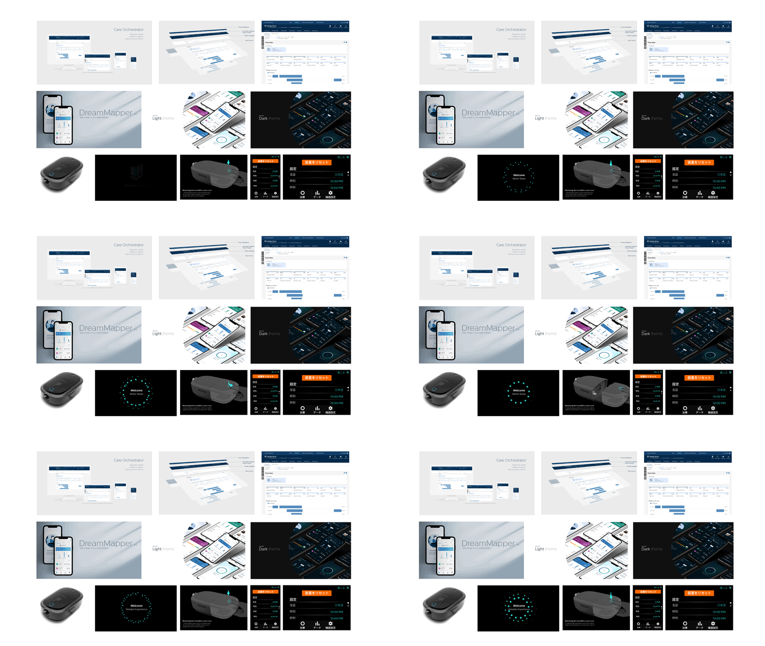
Case Study - Care Orchestrator Patient Header Improvement
Sleep and Respiratory Care Management System
Care Orchestrator is our breakthrough cloud-based application that connects homecare providers, physicians, and payers with patients – across the entire health continuum. It gives you the power and flexibility to optimize care for your sleep and respiratory patients.


Way of Working
Agile workflow
- Each month PI (Program increment)
- 2 Sprints
- Sprint plannings
- Each sprintEstimate storyTask follow upMid sprint check in
- Monthly Retro
Design workflow
- Get requirements from Product Owner
- Business need & Acceptance criteria
- UX Team reviews the requirements & creates wireframes
- Communicate with PO or other stakeholders
- Present solutions to large group - Product team
- Hand off to Dev
Request
01The ask
- Goal 1Redesign the patient header & navigation
Align Care Orchestrator with the Philips DLS.
- Goal 2Improve the navigation experience
Explore different ways to make the current CO navigation easier to use.
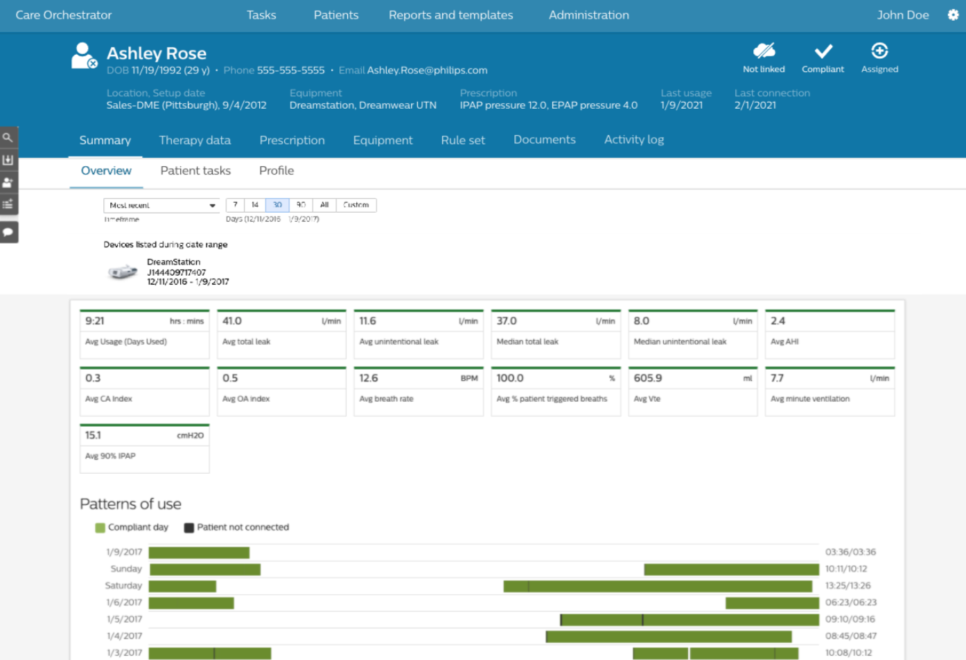
02Where we started · current patient header

03The problem · page anatomy before

Four layers of navigation and patient data stack up before the main content starts.
Pain Points
Complicated & Discoverability
Navigation level and navigation model are unclear.
Content Structure & Hierarchy
Indistinct and redundant controls increase complexity.
Visual & Philips Style
Cluttered visual flow and unfocused interactive pages.
Design Principles
Experience goals
- Usable
- Reliable
- Functional
Where all three meet: Pleasurable
Design Exploration
Information architecture
Before
- Patients
- Patient's Record
- Header tabsIdentityCare teamHealth statisticsRules & remindersCustomMore tabs ⚠
- SummaryOverviewPatient tasks
- Diagnostics
- Therapy dataReportsWaveforms
- Prescriptions
- Equipment
- Rule set
- Documents
- Activity log
After
- Patients
- Patient's Record
- Header tabsMoved to Patient Profile
- SummaryOverviewPatient tasksPatient Profile
- Diagnostics
- Therapy dataReportsWaveforms
- Prescriptions
- Equipment
- Rule set
- Documents
- Activity log
Content structure
Ideations - Usability Testing
Feedback from users
Positive feedback
- Like having availability in the top bar
- Easier to read
- Like the green icon for patient status, a great indicator
- The default view is enough to browse all information
- Love having all information on one page (Profile)
Questions & thoughts
- Will the Identity tab include a secondary phone number?PAMs call patients on multiple numbers
- Only Summary, Therapy data and Activity log are used on every patient
- PAMs only change Rules and remindersOver 70% of patients use this feature
- Not legibleAsked to find the setup date, users could not complete the task
- Hard to reach: click, scroll to the bottom, then find Rules and reminders

Feedback from users
Positive feedback
- Clear and legible: easier to read the data and know what you are looking at
- Being able to customize this later would help the workflow
- Love the "i": patient information and profile are there whenever needed
Questions & thoughts
- In the middle of a conversation with a patient, having the information right there makes it easier to check
- Important data to surface
🏆 Final Design

Design Comparison
Current vs new patient header & navigation
01Patient header & navigation
Header tabs removed, key patient details in one line


02Patient profile
Profile opens as a side panel instead of pushing content down


03Patient tasks
Tasks sit under the same slimmer header


Design hand off - Pixel perfect Design


Promotional Video
Results - Metrics of success
Design outcomes
- SimplifiedNavigation level and modelFewer clicks, with all the information in one sidebar.
- EasyVisual flow aligned with DLSHigh-contrast color and components, larger font size, accessibility passes AA.
- FreshContent structure and hierarchyLayouts for different screen sizes to meet the needs of different users.
All of my work is under an NDA, so please reach out to me personally if you have any questions regarding my work and also coffee chat anytime!
Cincinnati, OH USA
UX / UI Design Intern · Fall Co-op 2020
The Ethicon Team
Internship
During Fall 2020, amidst a global pandemic, I got the opportunity to intern as a UX/UI Designer on the J&J Ethicon team. My 3-month long intern project revolved around researching, designing, and prototyping medical products and usability testing.
Roles & Responsibilities
- Synthesize and shape large amounts of internal and external information to do dashboard/chart design based on the Website.
- Data visualization
- Build 2 clickable prototypes via Figma and Principle to do usability testing with 11 nurses.
Scenario 1, Troubleshooting Instrument/handpiece/generator module issues (Alarms)
Scenario 2, Configure System Settings (Profile Management) - Align current UI products and Digital solutions to create a cohesive and recognizable interaction design language system (DLS).
Project 1 Data visualization
Background
The NEUWAVE system offers unique features including a versatile probe portfolio with a PR probe to help protect non-target tissue, multi-probe synchrony and CO2 cooling to control the shape, size and burn pattern of your ablations. A web-accessible data portal that can query data collected and related to the Neuwave Microwave Ablation Procedure.
Goals
Design and develop an accessible data portal
Deliver supporting design/documentation for the portal
My job
Research/ Brainstorming
Design idea – chart/dashboard design


Project 2 Prototype & Usability Testing
Background
Integrates several energy generators into one device that supports the function of various surgical instruments.
Goals
Scenario 1, Troubleshooting Instrument/hand piece/generator module issues (Alarms)
Scenario 2, Configure System Settings (Profile Management)
My job
Prototype (Principle)
Usability testing - on call


Project 3 UI (DLS) Development
Background
Align the current Mantle user interface and J&J Brand to create a cohesive, easily understandable and recognizable visual and interaction system.
My job
Audit the icons across the different experiences, and group them into meaningful groups.
- Research
- Recommend grouping strategy
Benefits
Our Users
Lower learning curves
Less cognitive load
Fewer mistakes
Our Business
Faster time to market
Enhanced compliance
Great brand recognition
Our Team
Fast iterations
Great consistency
Improved collaboration


All of my work during the internship is under an NDA, so please reach out to me personally if you have any questions or want to know more details regarding my work and also happy to have a coffee chat anytime!
Team

Cambridge, MA USA
UX / UI Design Intern · Summer 2020
Design Innovation Team
Internship
During the summer of 2020, amidst a global pandemic, I got the opportunity to intern as a UX/UI Designer on the design innovation team. My 3-month long internship project worked on a medical device for a new interaction, and revolved around researching, designing, and prototyping medical products.
Roles & Responsibilities
- Working with Senior Design Researcher on new interactions in ICU, Ultrasound for Monitoring in the Design Innovation team.
- Helping the Business team visualize new product scenarios and storyboards.
- Working on Design Language System to create UI button motions.
- Responsible for defining the problem, Information architecture, Storyboard, Journey Map, Interactive mockup demo Prototype, UI Motion, and Video editing.
Project 1
New Interactions in ICU, Ultrasound for Monitoring
Background
In the (Medical, Surgical, and Cardiac) ICU managing complex, hemodynamically unstable patients require non-invasive, fast and robust clinical decision-making.
Goal
Provides a new standard of non-invasive care, displaying accurate, reliable and reproducible measures that seamlessly integrate and trend with other physiologic monitoring.
My job
Working with Senior Design Researcher in the Design Innovation team
- Responsible for Information architecture, Storyboard, Journey Map, Interactive Demo Prototype, UI Motion, and Video editing.

Prototype Video
help intensivists diagnose unstable patients easily and make decisions in time, while reducing infections, when they use ultrasound in the ICU?
Observation


Define Problems


Ideation


Project 2
UI Animation Tri-state button concept exploration
Background
Product A is the first ultrasound product that will be developed under the Rhythm platform which is based on DLS.
Role
Through this project, we explored possible design concepts and animation styles for the tri-state button, and tested the concept with internal/external clinical users to validate the concept.
Project process
- IdeationWork through the ideation stage together
- Concept visualizationVisualize key concepts
- PrototypingPrototype the animation effects
- Interview, review & iterationShow prototypes to internal stakeholders for feedback and iterate on concepts
- TestingTest concepts with clinical users if time and resources permit


All of my work during the internship is under an NDA, so please reach out to me personally if you have any questions or want to know more details regarding my work and also happy to have a coffee chat anytime!
Team

Home Employee Experience Hackathon
Team members
He Zhu, Yueqi Zhang, Jiaheng Wu
My role
Interactive design, Motion media design, video editing
Problem
We are trying to solve the problem that employees have low work productivity, caused by a lack of social interaction with their colleagues throughout a workday.
We are honored that we won first place in this 48-hour design challenge.
Let’s begin our story by meeting our leading actor Josh.

Social connectivity is the main source to facilitate his creative power. Since working from home, he has gradually lost his connection with his company and colleagues both physically and mentally. To solve this problem, his company is trying to help its employees to find a new tool.
 Process Book
Welcome to the cOoffice, a new generation remote work platform to power your work productivity by simulating your real workspace.
This morning at 8 o'clock, when Josh logged into the cOoffice, he was welcomed by his new, clean work environment with different work and break zones. He surprisingly found some of his colleagues were already there. They were working in their assigned areas and all of them were so excited to explore this new but familiar work environment.

After meeting their clients in a virtual conference room, Josh came across a problem: he could not start to work because he was confused with the requirement of the client. Oh wait, his boss James was online. Great, now he could just text him and have a quick discussion, with simple clicks.

At lunch, Josh could finally have a chance to talk with his best workmate David. They ate and discussed some ideas for their clients, and talked about the upcoming 3 o’clock happy hour happening in the break room.

Exciting Moment - Team Donut WON!!


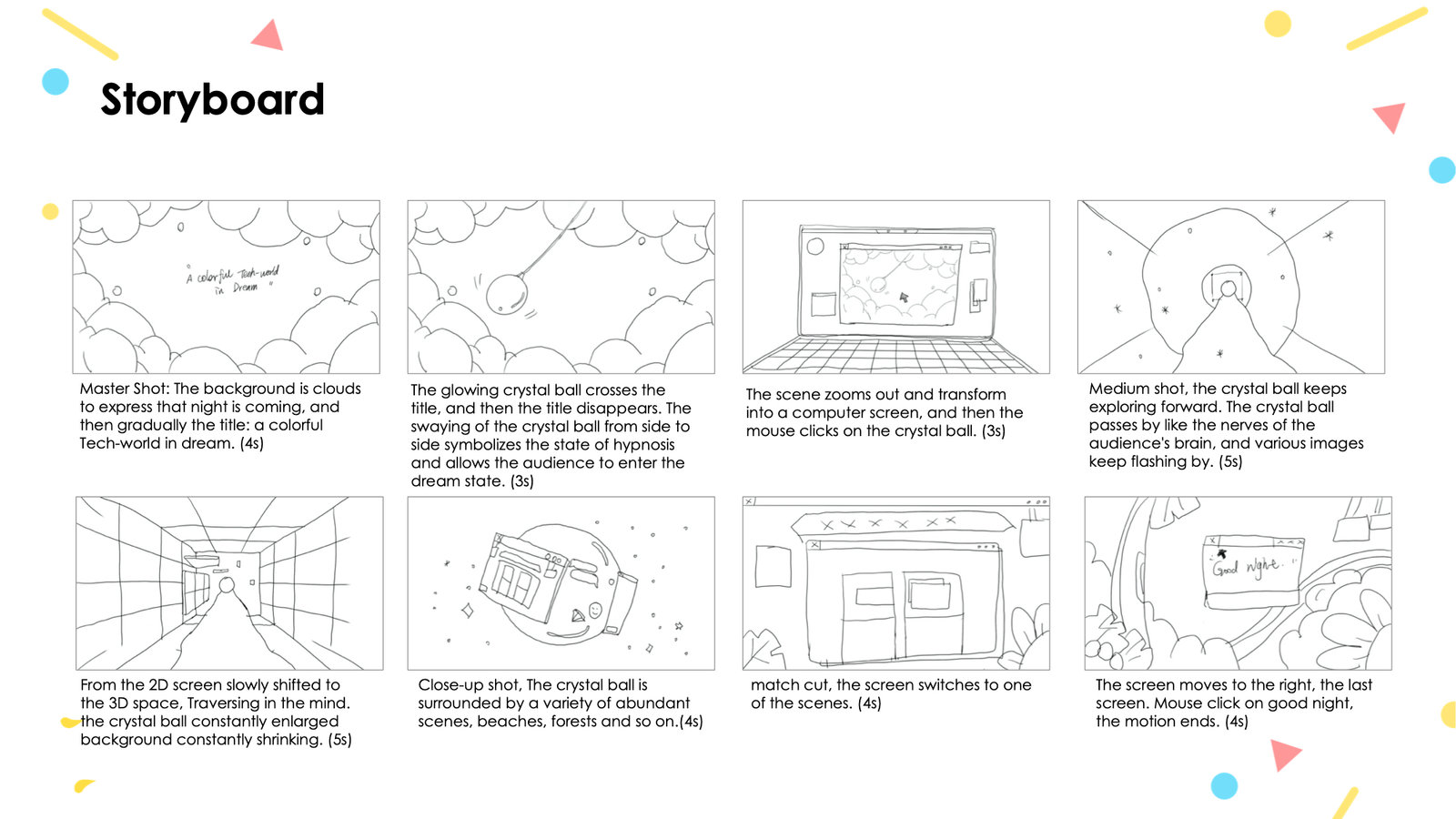
A Colorful Tech-world in Dream
The technological world is an ideal third party in the dream, and there is no space dimension. People can easily interact with this smart screen or the network. The audience can travel through the computer screen at any time —— Where they want to go, or to whom they want to see. They could get into the computer screen and see another world timely.



Logo Design Collection


Maison Margiela
Maison Margiela is a French luxury fashion house headquartered in Paris and founded in 1988 by Belgian designer Martin Margiela. The house produces both Haute couture-inspired artisanal collections and ready-to-wear collections. Maison Margiela is known for deconstructive and avant-garde designs with unconventional materials.


Borealis
Team members
He Zhu, Xiaojing Li, Jiaheng Wu
My role
Interactive design, Motion media design, video editing
Concept
Sea levels are rising, and oceans are becoming warmer. Longer, more intense droughts threaten crops, wildlife, and freshwater supplies. From polar bears in the Arctic to marine turtles off the coast of Africa, our planet’s diversity of life is at risk from the changing climate.
Borealis is an interactive installation designed to uncover that global warming has hastened the rate at which glaciers melt into the sea. The concept is to reveal how people’s thoughtless acts can destroy the environment. Humans need to be aware of the results of their destructive behaviors.
It's an honour to have this exhibited at the Jepson Center for the Arts Museum, Savannah GA.
How does it work
There are four stages of the whole process:
- Stage 1: The installation glows with Northern lights, which look like a scene of icebergs.
- Stage 2: After the installation detects audience, it goes into stage 2 where the light increases its brightness gradually and presents a color changing pattern. The speed of color change depends on the number of active sonar sensors.
- Stage 3: 4 polar bears are standing on the icebergs with blink LEDs inside that attract users to pick them up. Once they pick up the polar bears, the installation performs a spread light and plays drop animations. If all the polar bears are picked up, the light is gone. The melting motion is displayed and continued with a burning motion to urge people to return the polar bears.
- Stage 4: The model will be reset after all four polar bears are returned to the designated place.

